01
The challenge
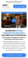
The existing page contained useful information, but long sections of copy and an outdated structure created friction between the advertising and the inquiry.
Key challenges included:
- Text-heavy content that was difficult to scan.
- Weak visual hierarchy.
- Important information that was harder to find.
- An unclear path to inquiry.
- Opportunities to better align advertising messages with the landing-page experience.
For a sensitive, high-consideration service, clarity and trust are essential to helping visitors understand their options.
02
What we changed
01. Benefit-Led Messaging
Reworked the content hierarchy to make the program’s key information easier to understand.
02. Clearer Page Structure
Organized the information into more scannable sections, helping visitors navigate the page without working through dense blocks of text.
03. Trust and Reassurance
Strengthened the presentation of relevant trust signals to support confidence during the decision-making journey.
04. Lead Capture and CTAs
Focused on a shorter lead-capture experience and more visible calls to action to make the next step easier to identify.
05. Creative and Landing-Page Alignment
Tested three advertising angles and focused on creating a closer connection between campaign messaging and the landing-page experience.
03
The transformation
The journey was structured around a clearer progression:
Paid Ad → Landing Page → Program Understanding → Lead Capture → Inquiry
The landing page and advertising were treated as one connected experience rather than separate marketing assets.
04
The outcome
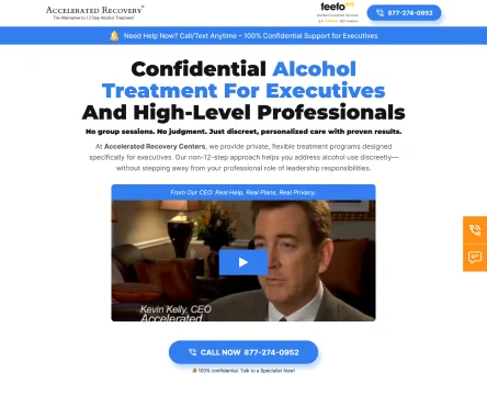
The project delivered a clearer landing-page experience, stronger alignment between advertising and page messaging, and a more focused path to inquiry.
05
The takeaway
A successful landing page must continue the promise made by the ad. When the message is clear, the content is easier to navigate, and the next step is visible, visitors have a more straightforward path to inquiry.